



Case Study — BlueDart
Flysafe
A refreshed identity for BlueDart's FlySafe journal — modernised for a progressive aviation brand, without letting go of the heritage it had built.
Familiar, made new.
A mark people had known for years. The brief was simple to say and hard to earn — bring it up to date without breaking the recognition it had already built.
Brief
BlueDart's FlySafe journal had carried the same visual identity for many years, becoming a familiar symbol within the organization's aviation division. While the publication held strong legacy value, the branding no longer reflected the company's progressive outlook and evolving aviation standards. As a creative partner recognized among top brand agencies, Norml was entrusted with refreshing the identity while preserving the heritage, credibility, and recognition that employees and stakeholders had associated with the publication over the years.
Challenge
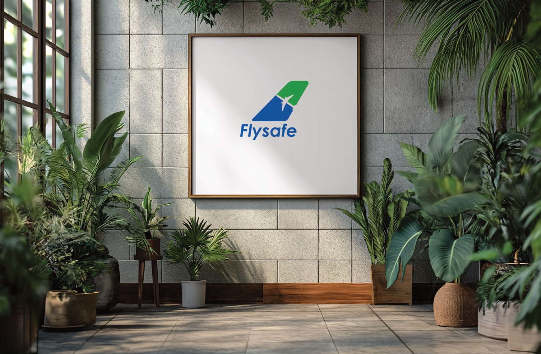
The greatest challenge was balancing innovation with legacy. The existing identity carried years of familiarity, making it essential to modernize without disconnecting from its established recognition. The redesigned logo needed to retain BlueDart's signature colour palette and aviation heritage while introducing a cleaner, more contemporary visual language. Every design decision had to respect the brand's history while positioning the publication for the future. This required the strategic thinking and creative expertise often associated with top brand strategy agencies that specialize in evolving established brands.
Discover
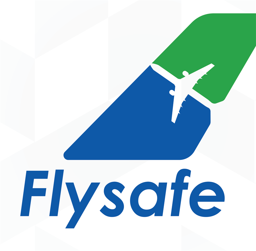
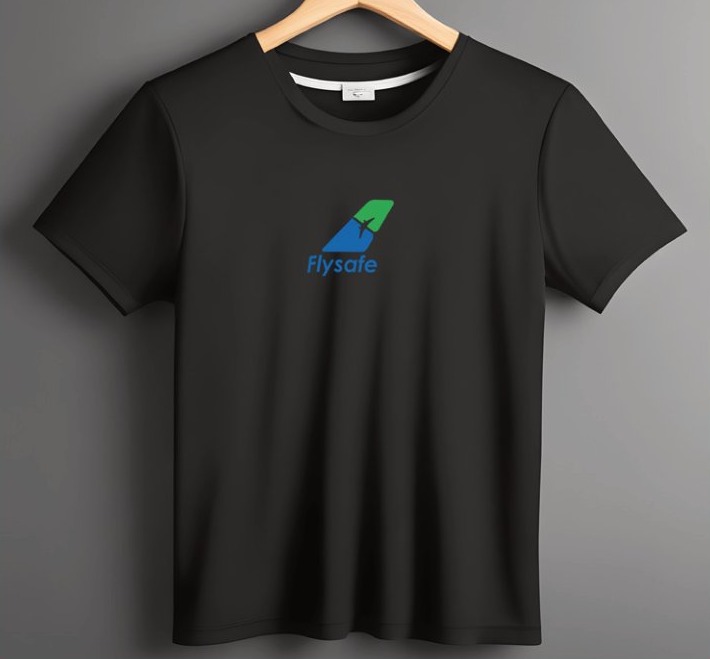
Our discovery process focused on understanding the core of BlueDart's aviation operations and the significance of the FlySafe initiative. Since the fleet primarily operates Boeing aircraft, we explored visual elements inspired by aircraft engineering and aerodynamics. This insight led us toward developing a logo built around the elegant outline of an aircraft wing, symbolizing safety, movement, precision, and continuous progress in every flight. The result was a distinctive visual identity that strengthened brand recognition while aligning with modern design standards.
Brand Story
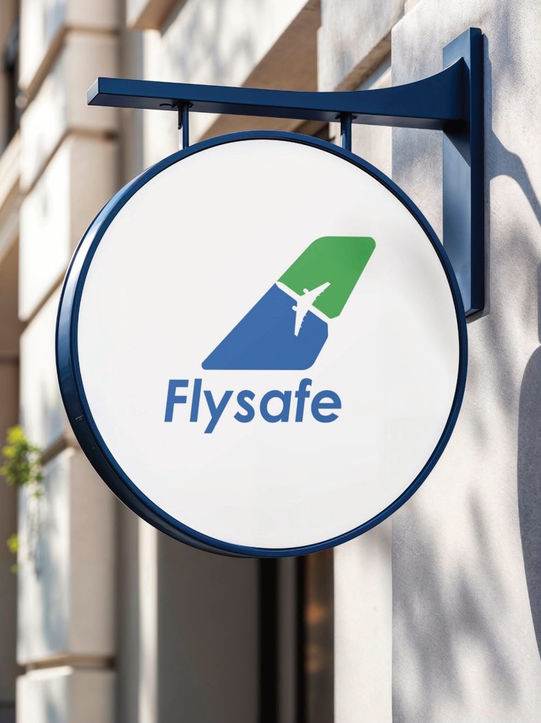
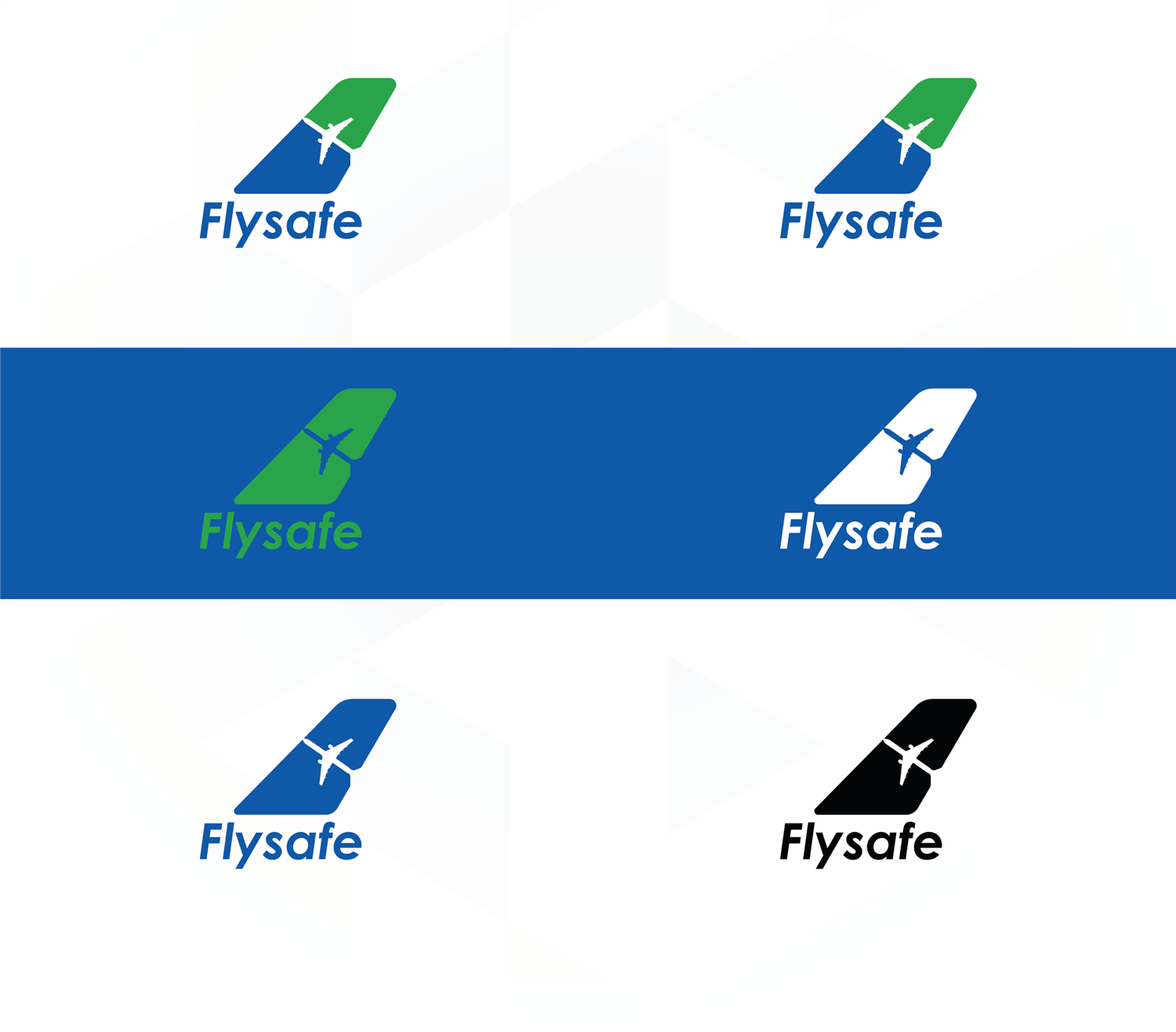
The final identity transforms a familiar publication into a modern aviation brand while preserving the trust it has built over the years. Inspired by the silhouette of an aircraft wing, the logo reflects confidence, direction, and operational excellence while remaining true to BlueDart's established visual language. The refreshed identity now appears consistently across the FlySafe journal, creating a timeless brand that celebrates both the company's rich legacy and forward-looking vision. This project highlights Norml's ability to deliver impactful brand transformations, positioning it among leading branding companies that create meaningful and enduring brand identities.