




Case Study — Vetrivel Construction
Vetrivel
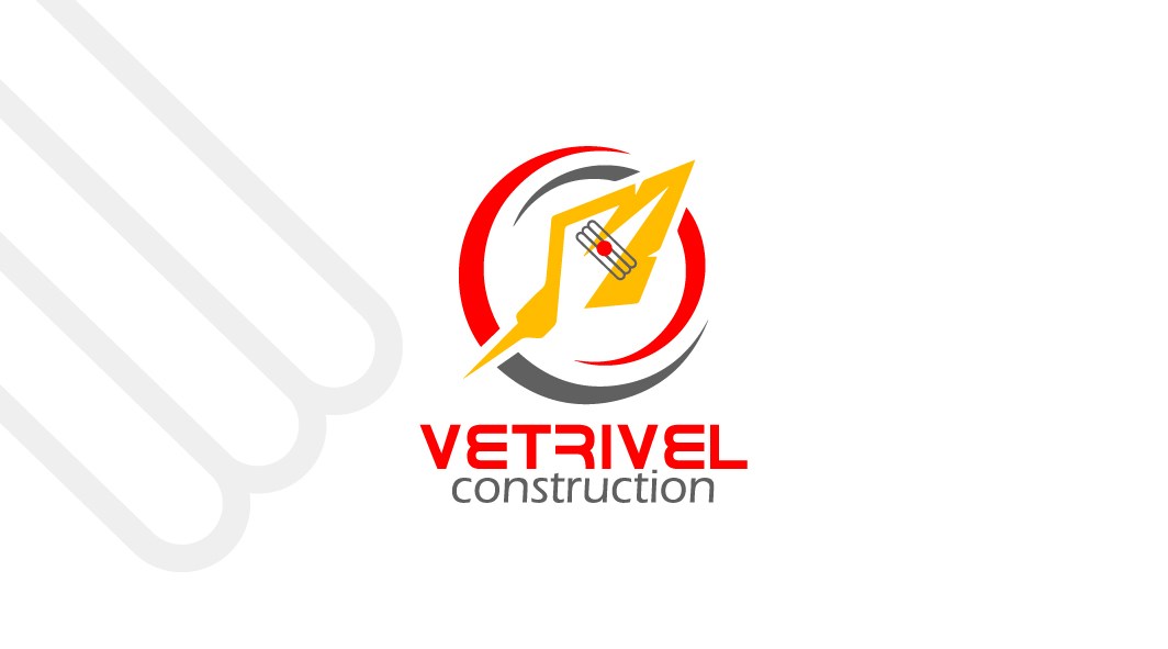
A brand identity for a construction firm — built on the strength of the spear, the Vel, and made to stand out where every builder looks the same.
Brief
Vetrivel Construction needed an identity with the weight to match the work — one that read as strong, dependable and unmistakably theirs in a market where most builders look the same. The mark had to carry both credibility and cultural roots, and travel cleanly from a site hoarding to a business card.
Challenge
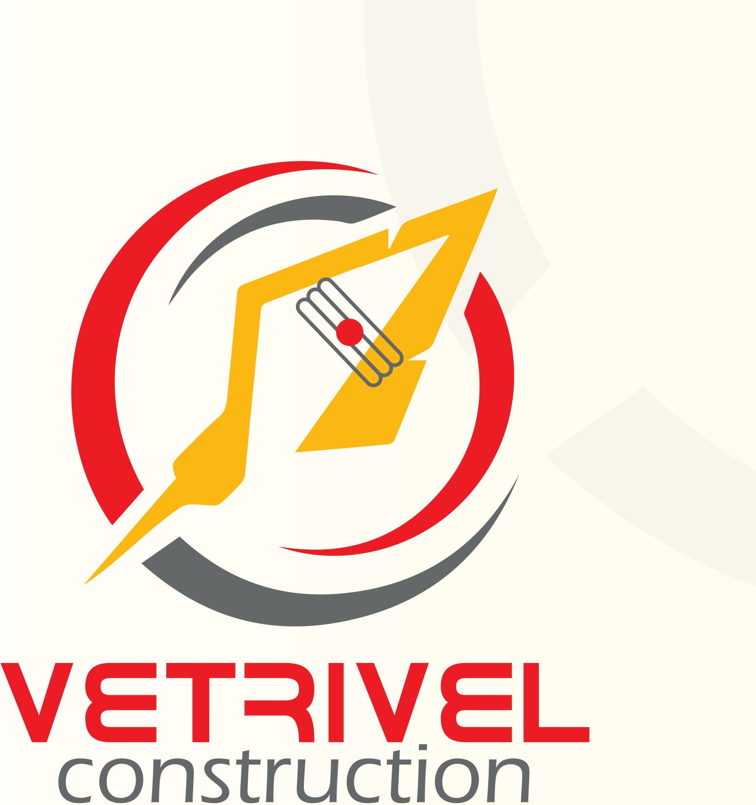
Construction is a trust business, so the identity had to feel established and safe without looking dated. The palette was chosen to carry that: red for energy and visibility, grey for stability and professionalism, gold for prestige and trust — combining motion with the reassurance clients want from a builder.
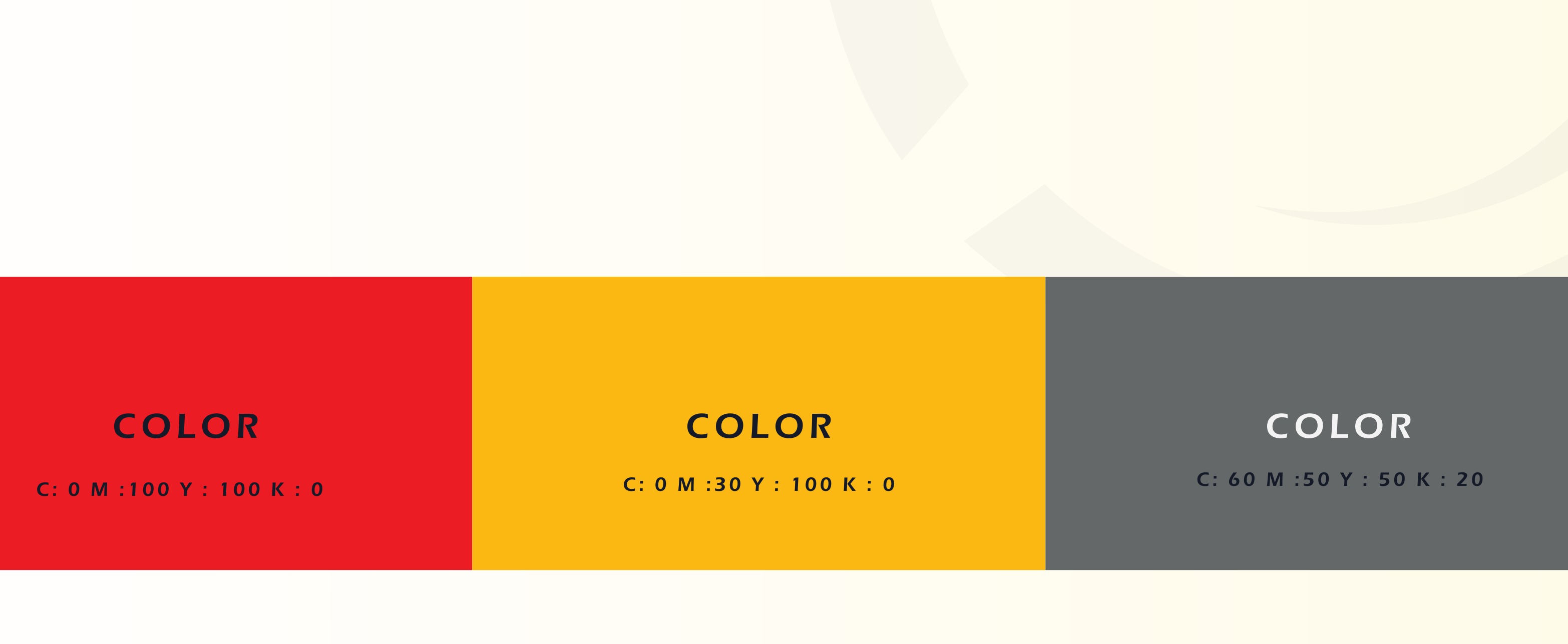
Discover
The name itself pointed the way. The golden "Vel" — the spear of Lord Murugan — stands for strength, victory and cultural identity, and gave the mark a story worth owning. The type voice was set to match: clean, modern and technical, so the whole system feels engineered rather than decorated.
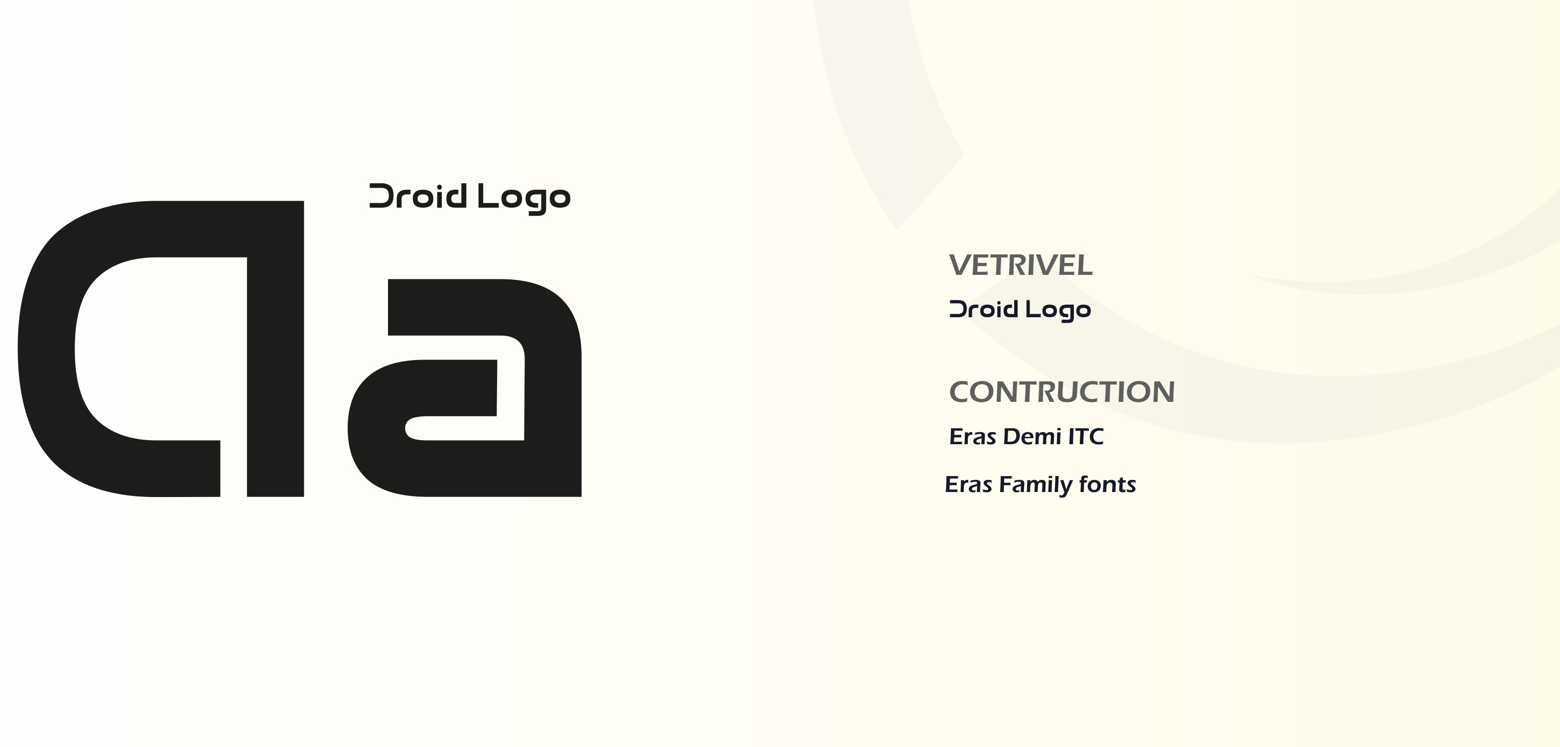
Brand Story
The final identity sets the golden spear inside a red-and-grey circular swoosh — motion, balance and modernity around a symbol of strength. It scales cleanly across signage, print, apparel and vehicles, giving Vetrivel a confident, coherent presence that finally matches the quality it builds.